Shopify Store Looks Good on Desktop but Bad on Mobile? Here's How to Fix It
Your Shopify store looks perfect on desktop but breaks on mobile? Here are the 12 real reasons it happens and the exact fixes, with 2026 conversion data.
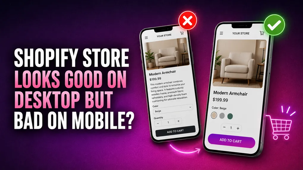
You spend a week getting your homepage exactly right. The hero image sits perfectly. The product grid is balanced. Every button lines up. Then you open the same store on your phone and it falls apart. Text runs off the edge. The banner headline covers half the model’s face. The “Add to cart” button is somewhere below three paragraphs of product description that nobody will ever scroll to.
If that sounds familiar, you are not doing anything unusual. Almost every store owner builds on a laptop, because that is where the theme editor lives. The problem is that almost nobody shops on a laptop anymore.
This guide walks through why the gap happens, what it actually costs you, and how to fix each specific issue. No fluff, no generic “make sure your site is responsive” advice. Just the things that break and how to unbreak them.
The gap is bigger than most merchants think
Here is the uncomfortable part. Mobile brings most of your traffic and converts at roughly half the rate.
Littledata’s Shopify benchmark puts average mobile conversion at 1.2% against 1.9% on desktop. Contentsquare’s 2026 report found desktop converting at 3.4% versus 2% on mobile, with mobile making up around 70% of all ecommerce traffic. Some 2026 datasets push mobile traffic share past 80% for direct to consumer brands.
Different studies give different numbers because they measure different store types. But the direction never changes. Mobile is where your customers are, and mobile is where you lose them.
Now do the math on your own store. If you get 50,000 mobile visits a month at a $40 average order value, moving mobile conversion from 1.2% to 1.8% is 300 extra orders. That is $12,000 a month from traffic you already paid for.
The other thing worth knowing: the gap is not inevitable. It exists mostly because stores get designed on a 27 inch monitor and then squeezed down. Fix the squeeze and a big chunk of the gap closes on its own.
Why your store looks fine on desktop and bad on mobile
There are four reasons this keeps happening, and understanding them saves you from chasing symptoms.
You designed in the wrong order. The theme editor opens in desktop view by default. You make decisions there, hit save, and the mobile version becomes whatever the theme’s fallback CSS decides. That fallback is a guess written by someone who never saw your content.
Horizontal space becomes vertical space. A three column section on desktop stacks into three full screens on mobile. What felt tight and scannable becomes a long scroll. Your key selling point moves from “visible immediately” to “four swipes down.”
Phones are slower. Mobile networks are worse, mid range Android chips are slower, and your theme is shipping the same JavaScript to both. A page that feels instant on fiber can take five seconds on a train.
Fingers are not cursors. A mouse pointer is one pixel wide. A thumb pad covers roughly nine millimetres. Elements that are easy to click become easy to miss.
First, actually see the problem
Before you change anything, look at real data. Guessing wastes days.
Check your device split. In Shopify admin, go to Analytics, then Reports, then Sessions by device type. Then look at conversion rate broken down the same way. Write both numbers down. This is your baseline and you will want it later.
Test on a real phone, not a simulator. Open your live store on your own phone, on mobile data, not office WiFi. Then borrow a cheaper Android from someone. The gap between an iPhone 16 on WiFi and a three year old Android on 4G is the gap between what you think customers see and what they actually see.
Use Chrome DevTools for fast iteration. Right click, Inspect, then click the device toolbar icon. Test at 375px width, which covers older iPhones and most small Androids. If it works at 375px it works nearly everywhere. This is for quick checks only, because it does not simulate real network speed or a slow processor.
Run PageSpeed Insights on your homepage, a collection page, and a product page. Look at the mobile tab. Ignore the big score for a moment and read the three Core Web Vitals numbers underneath.
Check Google Search Console. The Core Web Vitals report there uses real visitor data from Chrome users, which is what Google actually ranks on. Note that this data moves on a 28 day rolling window, so a fix you ship today will not show up for weeks. Do not panic and revert a good change because the number has not moved yet.
The three numbers that matter, and what counts as passing:
| Metric | What it measures | Good |
|---|---|---|
| LCP (Largest Contentful Paint) | How fast the main content appears | Under 2.5 seconds |
| INP (Interaction to Next Paint) | How fast the page responds to taps | Under 200 milliseconds |
| CLS (Cumulative Layout Shift) | How much the page jumps while loading | Under 0.1 |
Google scores these at the 75th percentile, meaning 75% of real visits have to hit the threshold. INP replaced First Input Delay back in March 2024, so any guide still telling you to optimise FID is out of date.
The 12 things that break on mobile, and how to fix each one
1. Horizontal scroll
You swipe up and the whole page drifts sideways. This is the single ugliest mobile bug and it is almost always one element that is wider than the screen.
Find it: In Chrome DevTools with mobile view on, open the Console and run:
document.querySelectorAll('*').forEach(el => {
  if (el.offsetWidth > document.documentElement.clientWidth) console.log(el);
});
That prints every element wider than the viewport. Usually it is one table, one embedded video, or a section with a fixed pixel width.
Fix it: Add this to Online Store, Themes, Customize, Theme settings, Custom CSS:
@media screen and (max-width: 749px) {
  img, video, iframe, table { max-width: 100%; height: auto; }
}
Also confirm your theme has a proper viewport meta tag in theme.liquid. Every modern Shopify theme includes one, but custom builds sometimes lose it:
<meta name="viewport" content="width=device-width, initial-scale=1">2. Text that is too small to read
Body copy at 14px looks refined on a monitor and looks like fine print on a phone. Nobody zooms in to read your product description. They leave.
Set mobile body text to 16px minimum. Sixteen is not a WCAG rule, but it is the practical floor for comfortable reading at arm’s length. Product titles want around 20px to 24px, and price wants to be visually louder than everything except the buy button.
There is a second reason 16px matters. On iOS Safari, if a form input has a font size under 16px, the browser automatically zooms in when someone taps it. The customer types their name, and suddenly the whole page is magnified and skewed. It looks broken, because it effectively is.
@media screen and (max-width: 749px) {
  body, p { font-size: 16px; line-height: 1.6; }
  input, select, textarea { font-size: 16px; }
}
That last line is one of the highest value single fixes on this whole page.
3. Buttons and links too small to tap
WCAG 2.2 sets 24 by 24 CSS pixels as the accessibility minimum. Apple’s Human Interface Guidelines recommend 44 by 44 points. Google’s Material Design says 48 by 48. Google’s own web.dev guidance suggests around 48 pixels, which works out to roughly the size of a finger pad, plus about 8 pixels of space between targets.
Aim for 48px on anything commercially important. Quantity steppers, variant swatches, the cart icon, filter chips, and close buttons on popups are the usual offenders.
@media screen and (max-width: 749px) {
  button, .btn, a.button, input[type="submit"] {
    min-height: 48px;
    min-width: 48px;
    padding: 12px 20px;
  }
}
Also keep primary actions at least 16px away from the screen edge. Buttons pinned right against the edge fight with the phone’s own back swipe gesture, so people trigger navigation when they meant to buy.
4. Hero banners that crop badly
Your desktop hero is 1920 by 800, a wide landscape shot with the headline on the left. On a 390px screen the theme crops the centre, so your model’s shoulder gets the spotlight and your headline lands on top of a busy part of the image.
Most modern themes let you upload a separate mobile image in the banner section settings. Use it. Shoot or crop a portrait version, roughly 4:5 or 1:1, with the subject centred and dead space where the text goes.
If your theme does not offer a mobile image slot, add a semi transparent overlay so text stays readable no matter what gets cropped:
@media screen and (max-width: 749px) {
  .banner__media::after {
    content: ""; position: absolute; inset: 0;
    background: rgba(0,0,0,0.35);
  }
}
Also cut the hero height on mobile. A full screen hero pushes every product below the fold. Around 60% to 70% of viewport height is plenty.
5. Slow loading images
Images are the biggest reason mobile LCP fails. Google’s data shows LCP is the hardest of the three vitals to pass on mobile, and around three quarters of the time the LCP element is an image.
Practical steps:
- Serve WebP instead of JPEG or PNG. Roughly 25% to 35% smaller at the same quality.
- Stop uploading 4000px wide product photos. Nothing on a phone needs more than 1600px.
- Never lazy load the hero image or the first product photo. Lazy loading them delays exactly the thing Google measures. Add
loading="eager"andfetchpriority="high"to the LCP image. - Lazy load everything below the fold.
- Compress before upload with TinyPNG or Squoosh rather than relying on an app to do it after the fact.
Google and Deloitte’s “Milliseconds Make Millions” study found that a 0.1 second improvement in mobile load time lifted retail conversions by 8.4%. Speed work pays back harder on mobile than anywhere else.
6. Layout that jumps while loading
You go to tap a product and the page shifts, so you tap an ad or the wrong item instead. That is CLS, and it makes a store feel amateur even when everything else is polished.
Three causes cover almost all of it:
- Images without dimensions. Always include
widthandheightattributes so the browser reserves the space before the file arrives. - Web fonts swapping in. Add
font-display: swapand preload your primary font file. - Apps injecting content. Announcement bars, cookie banners, and review widgets that load late push everything down. Reserve fixed height for them with
min-heighton their container.
7. Sticky bars stacking up
Sticky header. Announcement bar. Free shipping progress bar. Cookie consent. Chat bubble. Sticky add to cart. Each one seemed like a good idea on its own. Together they eat 40% of a 667px screen before any content loads.
Pick two. Realistically: a sticky header that shrinks on scroll, and a sticky add to cart on product pages. Everything else gets cut on mobile or converted to something less intrusive. The chat bubble in particular tends to sit right on top of the buy button.
8. Popups that trap people
An email popup with a close button that renders half off screen is a guaranteed bounce. If someone cannot dismiss it, they cannot buy.
For every popup, check on a real 375px screen that the X is fully visible, at least 44px, and not overlapping anything. Better: on mobile use a bottom sheet or a slim bar instead of a centre modal. Exit intent barely works on touch devices anyway, since there is no cursor to leave the window. Trigger on scroll depth or time instead.
9. Navigation nobody can use
A mega menu with six columns collapses into a hamburger that hides everything. Then the accordion needs three taps to reach a product category.
Flatten mobile navigation to a maximum of two levels. Put your top three or four collections at the top of the drawer, not buried. Make search prominent, since mobile users search far more than desktop users do. If you sell more than about 30 products, put a search icon directly in the header rather than inside the menu.
10. Product page information in the wrong order
This is the fix with the biggest revenue impact and the one most people skip.
On desktop, image on the left and everything else on the right means the customer sees the photo, title, price, reviews, and buy button all at once. On mobile that same layout stacks vertically, so the buy button lands somewhere around the third screen.
Reorder for mobile so the first screen carries: image, title, price, star rating, variant selector, add to cart. Description, shipping info, and specs go below that. Most Online Store 2.0 themes let you drag blocks in the product template, and the order carries over. Where it does not, CSS flexbox order handles it inside a mobile media query.
Then check the accordions. Shipping and returns info should be collapsed by default on mobile, expanded only if the customer wants it. Six paragraphs of policy text between the price and the button is a conversion killer.
11. Forms with too much friction
Every field you add costs you orders, and on mobile the cost is much higher because typing is harder.
- Set the right keyboard for each field.
type="tel"for phone,type="email"for email,inputmode="numeric"for postal codes. A customer who gets a number pad for their phone number is a customer who does not give up halfway. - Turn on
autocompleteattributes so the browser can fill saved details in one tap. - Full width fields, single column. Side by side fields on a 375px screen are cramped.
- Cut optional fields. If you do not use it to fulfil the order, delete it.
- Validate inline, next to the field, not in an error summary at the top that the customer has to scroll back up to read.
This matters most on any custom order form or landing page you have built outside the standard checkout, since Shopify’s own checkout is already tuned for mobile and yours probably is not.
12. App bloat and animations
Every app you install adds JavaScript, and JavaScript is what wrecks INP on mid range phones. A store running fifteen apps is often shipping two megabytes of script before a single product loads.
Audit honestly. Open Online Store, Themes, Edit code, and search for leftover script tags from apps you uninstalled months ago. Uninstalling an app does not always remove its code.
Animations are the other silent tax. Scroll reveals, parallax, hover transitions, fade ins. They look premium on a desktop and drag on a phone. Shopify’s Horizon theme ships with heavy default animations, and testers have reported around 8 to 12 PageSpeed mobile points recovered from switching them to reduced motion in Theme settings. That is one toggle.
A note on Dawn and Horizon
Since Horizon became the default free theme for new stores, this comes up constantly.
Both are built by Shopify and both are responsive. But on a clean demo store, Horizon has been measuring around 52 on PageSpeed mobile against Dawn’s 82, while both sit in the mid to high 90s on desktop. The reason is straightforward: Horizon ships more JavaScript by default for its block system and animations.
That gap is closing quickly as Shopify ships updates, and a tuned Horizon store typically lands in the low to mid 70s once you kill animations and audit your apps. But it is worth knowing why your brand new store scores worse on mobile than your old one did, when nothing looks wrong.
Practical read: if you are launching fresh and want the layout flexibility, Horizon is fine as long as you do the mobile tuning. If you have a mature Dawn store that performs well, migrating costs you a full rebuild for no immediate gain.
Test before you ship, every time
Once you have made changes, run through this before publishing. It takes about ten minutes.
Homepage
- No sideways drift when scrolling
- Hero readable, headline not sitting on a busy part of the image
- Products visible within one or two swipes
- Menu opens and closes cleanly
Collection page
- Two columns, not one, so shoppers can compare
- Filters reachable without hunting
- Product titles not truncated to nonsense
Product page
- Image, title, price, and buy button all within the first screen
- Image gallery swipes properly
- Variant selectors easy to tap
- No text zoom when tapping a field
Cart and checkout
- Quantity controls large enough to hit
- Express payment options showing
- Correct keyboard appears for every field
Across the whole store
- Real phone, mobile data, not WiFi
- Both an iPhone and a mid range Android
- Loads in under three seconds
What to fix first
Do not try to do everything in one week. Ranked by impact against effort:
- Fix horizontal scroll. Ugly, obvious, usually a ten minute fix.
- Set inputs to 16px. Stops the iOS zoom bug immediately.
- Reorder the product page so the buy button is above the fold. Biggest revenue lever here.
- Compress images and stop lazy loading the hero. Biggest speed lever.
- Enlarge tap targets to 48px.
- Cut sticky elements down to two.
- Turn off animations on mobile.
- Audit apps and remove dead code.
Ship one at a time and watch your mobile conversion number in Shopify Analytics. If you change eight things at once and conversion drops, you will not know which one did it.
Frequently asked questions
Why does my Shopify theme say it is responsive if it still looks bad on mobile? Responsive means the layout reflows to fit the screen. It does not mean the result is good. A three column section reflowing into three stacked screens is technically responsive and practically terrible. Responsive is the floor, not the finish line.
Can I fix mobile without touching code? Most of it, yes. Theme editor mobile view, mobile specific image slots, block reordering, and section visibility toggles cover the majority of layout issues. The CSS snippets above go into Theme settings, Custom CSS, which is a text box in the editor and does not require touching theme files.
How do I preview mobile properly in the Shopify theme editor? There is a device toggle at the top of the editor. Use it, but do not trust it alone. It shows layout, not speed, and not how a real thumb behaves. Always confirm on an actual phone before publishing.
Does mobile design affect my Google rankings? Yes. Google indexes the mobile version of your site, so what mobile crawlers see is what gets ranked. Core Web Vitals are a confirmed ranking signal, though they work mostly as a tiebreaker between pages of similar quality and relevance. In a competitive category, that tiebreaker decides who sits at position two instead of position six.
My PageSpeed mobile score is 45. Is my store broken? Not necessarily. The Lighthouse score is a lab simulation. What Google actually ranks on is field data from real Chrome users, shown in Search Console. Use the score to find problems, use the field data to decide whether you have a real one.
How long until I see results? Layout and usability fixes show up in your conversion rate within days. Core Web Vitals move slower because Google uses a 28 day rolling average. Give it a month before judging a speed change.
The short version
Your store does not look bad on mobile because your theme is bad. It looks bad because it was designed on a screen that almost none of your customers use, and then handed to mobile as an afterthought.
The fix is not a redesign. It is a sequence of specific corrections: kill the horizontal scroll, make text and buttons finger sized, get the buy button above the fold, shrink the images, and cut the things that eat the screen.
Start by opening your own store on your phone, on mobile data, and buying something from yourself. Whatever annoys you in that first minute is where your money is leaking. Fix that first.