Shopify COD Form Best Practices: 12 Things Every Store Should Get Right
Learn 12 Shopify COD form best practices to create a faster, clearer, mobile-friendly ordering experience and reduce common COD order problems.
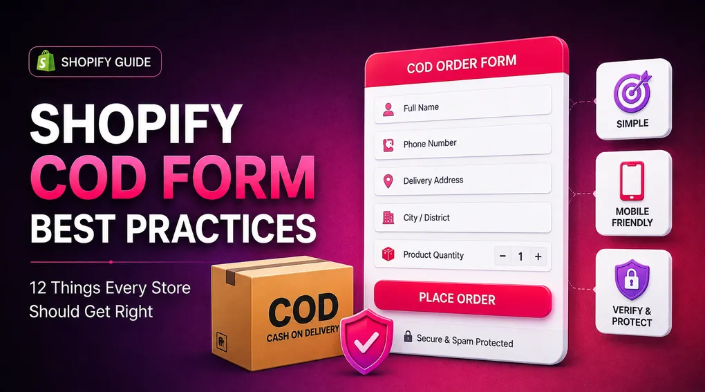
Cash on Delivery can be a powerful payment option for Shopify stores.
Instead of asking customers to pay before they receive their order, COD lets them place an order and pay when the package arrives. For customers who are less comfortable with online payments, this can make the buying process feel easier and more familiar.
But offering COD is not just about adding a payment option.
The form customers use to place a COD order can have a major impact on the quality of the information you receive, the number of successful orders you fulfill, and how easy the ordering experience feels.
A form that asks for too much information can frustrate customers. A form that asks for too little can leave you with incomplete delivery details. Poor mobile design can make the process difficult to complete, while missing verification and validation can create unnecessary failed orders.
So what makes a good COD form?
Here are 12 things every Shopify store should get right.
1. Keep the COD Form Simple
The first rule is also one of the easiest to overlook: don’t ask customers for information you don’t actually need.
Every additional field creates another decision or typing task for the customer.
This matters even more on mobile. Baymard’s checkout research consistently shows that the number of form fields users have to deal with is more important to checkout usability than simply counting the number of checkout steps. Its 2024 benchmark found an average checkout contained 11.3 form fields, while 17% of users had abandoned because of checkout complexity.
For a COD form, start with the information you genuinely need to process and deliver the order.
A typical starting point might include:
- Full name
- Phone number
- Delivery address
- District or city
- Postal code, where applicable
- Shipping method, if you offer multiple options
If you don’t need a particular field to process the order, question whether it belongs on the form.
A shorter form isn’t automatically better, but unnecessary fields rarely make it better.
2. Design for Mobile First
Most COD customers are likely to encounter your form on a smartphone.
That means your form should be designed for a small screen first, not designed on desktop and simply squeezed into a mobile layout later.
Mobile forms have their own usability challenges. The keyboard can take up a large part of the screen, users have less visible context, and small controls can be difficult to tap. Baymard’s mobile checkout research specifically highlights problems caused by unclear labels, poor field layouts, and unnecessary interactions.
Your COD form should therefore have:
- Large, easy-to-tap fields
- Clear labels above the fields
- Comfortable spacing
- A clearly visible primary button
- Easy-to-read text
- No horizontal scrolling
- Fast loading on mobile
Before publishing your form, actually place an order using your own phone.
Don’t just resize the browser window on your computer.
Open the store on a real smartphone and complete the entire COD process as a customer.
3. Ask for a Clear Phone Number
The phone number is especially important for COD orders.
It can be used for delivery communication, order updates, customer support, and, if you use it, OTP verification.
But simply adding a field called “Phone” isn’t enough.
The customer should immediately understand what number you need and why.
For example:
Mobile Number
We’ll use this number to confirm your order and contact you about delivery.
Clear explanations can reduce hesitation when a phone number is required. Baymard’s checkout research specifically recommends explaining why a phone field is required rather than simply presenting it as a mandatory field without context.
Also avoid splitting one phone number into multiple separate fields.
On mobile, this creates unnecessary interactions and makes the form harder to complete.
A single phone field with appropriate validation is usually a much cleaner experience.
4. Use the Right Fields for Your Market
Not every store needs the same address structure.
The information required to deliver an order can vary significantly between countries and regions.
For example, a Bangladesh-focused store may need:
District → Thana → Address
An India-focused store may use:
State → City → PinCode → Address
Another market may use provinces, emirates, regions, or different administrative structures.
Your COD form should reflect how customers actually describe their delivery location.
Don’t force every store into the same generic address structure.
At the same time, don’t create a huge list of location fields just because your form builder supports them.
Use the smallest structure that gives your fulfillment team and courier enough information to deliver the package.
5. Make Shipping Costs Clear
One of the easiest ways to create confusion is to hide the shipping cost until the customer has already completed most of the form.
If you offer different shipping rates, show them clearly.
For example:
Inside City — ৳60
Outside City — ৳120
Or:
Standard Delivery — $5
Express Delivery — $10
Customers should know what they’re agreeing to before submitting the order.
This is especially important for COD because customers are agreeing to pay the total amount when the order arrives.
Clear shipping information also helps reduce unpleasant surprises later in the process. Baymard’s checkout research identifies total order cost and shipping information as important parts of the checkout experience.
6. Show the Total Order Amount Before Submission
Your customer should not have to guess how much they will pay.
Before the final button, make the important order details easy to understand:
Product: Premium T-Shirt × 2 Subtotal: $40 Shipping: $5 Total: $45
This is particularly important when the COD form includes shipping fees, discounts, quantity offers, or upsells.
If the customer adds an offer, the final amount should update clearly.
A customer who sees the exact amount before submitting the order is less likely to be surprised later.
It also gives them one final opportunity to catch an incorrect quantity or shipping option before the order is created.
7. Use Clear Field Labels and Helpful Validation
A COD form should not make customers guess what you mean.
Compare these two labels:
Address
and
Full delivery address
The second one provides more context.
The same principle applies to error messages.
Instead of:
Invalid input
tell the customer what needs to be corrected:
Please enter a valid mobile number.
Or:
Please enter your full delivery address.
This becomes especially important on mobile because customers may only see one or two fields at a time while the keyboard is open.
Baymard’s mobile research found that unclear field descriptions and poor error handling can create significant usability problems during checkout.
Good validation shouldn’t feel like a punishment.
It should help the customer finish the form correctly.
8. Add OTP Verification When Your Store Needs It
A good COD form isn’t only about collecting information.
You also need to think about the quality of the orders you’re receiving.
OTP verification can add another layer of protection by asking the customer to verify the phone number they entered.
The process is simple:
Customer enters phone number → OTP is sent → Customer enters OTP → Phone is verified → Order continues
This can help with incorrect or unreachable phone numbers and can reduce some types of low-quality COD orders.
OTP is not a complete fraud solution. A genuine phone number can still be used for an order that later gets refused.
That’s why OTP works best alongside other controls such as phone blocking, IP blocking, postal-code validation, and order review.
Shopify’s App Store currently includes COD-focused apps offering OTP verification as part of their fraud and order-management features, showing how common phone verification has become within the COD app category.
9. Don’t Turn Your COD Form Into a Second Checkout
A COD form should make ordering easier, not recreate every step of a traditional checkout.
One reason merchants use dedicated COD forms is to give customers a more direct ordering experience.
The goal should be simple:
Product → COD form → Order
not:
Product → Cart → Account → Address → Shipping → Payment → Confirmation → More fields → Order
That doesn’t mean you should remove important information.
It means you should remove unnecessary friction.
If your COD form can collect the required delivery information and create the order without forcing customers through unnecessary steps, the experience can feel much faster.
The Shopify App Store has a growing category of COD form apps built around this streamlined approach, including customizable one-click-style COD forms and embedded or popup layouts.
10. Make the Main Button Obvious
The final action should never be confusing.
A customer should immediately understand what happens when they press the primary button.
Instead of a generic button such as:
Submit
consider something more specific:
Place COD Order
or:
Order Now
The button should also visually stand out from secondary actions.
If your form offers another payment option, such as online payment, don’t let the two actions compete equally for attention.
For example:
Place COD Order
Pay Online
The exact wording depends on your store, but the hierarchy should be obvious.
Customers shouldn’t have to stop and figure out which button actually places their order.
11. Test the Complete Order Flow Before Going Live
A COD form can look perfect in the editor and still have problems when a real customer uses it.
That’s why testing the complete flow is essential.
Place test orders yourself and check:
- Does the form open correctly on mobile?
- Are all required fields working?
- Does phone validation work?
- Does OTP verification work, if enabled?
- Are shipping rates correct?
- Is the final order amount correct?
- Does the order appear correctly in Shopify?
- Are customer details saved correctly?
- Does the thank-you page work?
- Do tracking events fire correctly, if you’re using pixels?
Don’t test only the happy path.
Try entering an invalid phone number.
Try leaving a required field empty.
Try switching shipping options.
Try changing the quantity.
Try refreshing the page at different points.
These tests can uncover problems that aren’t visible in the form editor.
12. Keep Improving the Form With Real Order Data
Your first COD form doesn’t have to be your final COD form.
Once you start receiving orders, your own store data becomes one of your best sources of information.
Look at questions such as:
- Which fields do customers frequently enter incorrectly?
- Which delivery areas generate the most failed orders?
- How often are COD orders refused?
- Are customers abandoning the form at a particular field?
- Are certain phone numbers or IP addresses repeatedly associated with poor-quality orders?
- Are customers choosing one shipping option more often than another?
- Are upsells causing confusion or improving the order value?
Use those observations to improve the form.
For example, if customers repeatedly enter incomplete addresses, you may need clearer address instructions.
If a particular field is almost never useful, consider removing it.
If fake orders are a problem, add verification or stronger fraud controls.
The best COD form is not simply the one with the most features.
It’s the one that works well for your actual customers and your actual fulfillment process.
A Simple Shopify COD Form Checklist
Before publishing your COD form, run through this checklist:
| Area | What to check |
|---|---|
| Form fields | Only ask for information you actually need |
| Mobile design | Test the entire form on a real smartphone |
| Phone number | Use one clear phone field with proper validation |
| Address | Match the location structure to your market |
| Shipping | Show available rates clearly |
| Total | Display the final amount before submission |
| Validation | Explain errors in plain language |
| Verification | Consider OTP for higher-risk COD orders |
| Fraud control | Use additional checks when necessary |
| CTA | Make the primary order button obvious |
| Testing | Place real test orders before launch |
| Optimization | Improve the form using real order data |
How Neo COD Form & Upsell Helps You Get These Basics Right
Building a good COD form doesn’t mean adding every feature available.
It means having the right tools to create a form that fits your store.
Neo COD Form & Upsell gives Shopify merchants a customizable COD form that can be configured around their products, customers, and delivery workflow.
You can customize the form fields, configure shipping rates, add a custom thank-you page, and use COD-focused tools such as OTP verification, phone and IP blocking, and postal-code validation.
The app also supports upsells, downsells, quantity offers, tracking pixels, and other features designed around the COD selling journey.
That means you can start with a clean ordering form and add more functionality as your store needs it.
Frequently Asked Questions
What should a Shopify COD form include?
At minimum, most stores need enough information to identify the customer and deliver the order, such as a name, phone number, and delivery address. Depending on the market, you may also need location fields, postal code, and shipping selection.
The exact fields should depend on your fulfillment requirements.
How many fields should a COD form have?
There is no universal number.
The better rule is to use the fewest fields necessary to successfully process and deliver the order. Unnecessary fields create more work for customers, particularly on mobile devices.
Should I use OTP verification on my COD form?
If fake orders, incorrect phone numbers, or failed deliveries are a concern, OTP verification can be a useful additional layer.
It verifies access to the phone number but doesn’t guarantee that the customer will accept the package.
Should my COD form work on mobile?
Absolutely.
A large portion of ecommerce traffic comes from mobile devices, and mobile forms have unique usability challenges. Your form should be tested on real phones rather than relying only on desktop previews.
Should I show the shipping cost on the COD form?
Yes, whenever possible.
Customers should understand the delivery cost and final amount before they submit the order. Clear pricing reduces surprises and makes the ordering process easier to understand.
Final Thoughts
A successful COD form isn’t about adding as many fields or features as possible.
It’s about removing unnecessary friction while collecting the information your business actually needs.
Keep the form simple. Design it for mobile. Make the phone and address fields clear. Show shipping and the final order amount. Validate information properly. Add OTP and other fraud controls when your store needs them. Then test the entire flow and keep improving it based on real customer behavior.
These small details can make a big difference in how smoothly your COD operation runs.
If you’re looking for a Shopify COD form that gives you the flexibility to build this kind of ordering experience while also providing OTP, fraud controls, upsells, and other COD-focused tools, take a look at Neo COD Form & Upsell.
Get Neo COD Form & Upsell on Shopify.
The best COD form isn’t the one with the most features.
It’s the one that makes it easy for the right customer to place the right order with the right information.