How to Build a High-Converting COD Product Page for Shopify
A cash on delivery product page has different rules than a normal Shopify page. Here is the exact layout, form setup, and trust elements that turn more visitors into delivered orders.
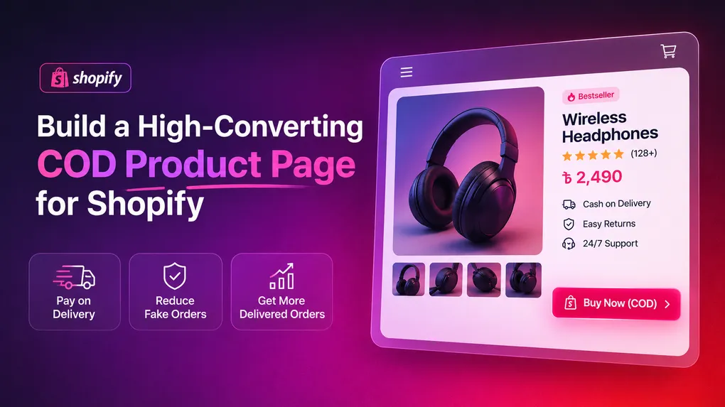
Most product page advice on the internet is written for stores where people pay by card.
Big lifestyle photos, a clean “Add to Cart” button, a shipping estimate, some reviews, done. That advice is not wrong. It is just built for a different buyer.
If most of your customers pay cash at the door, your product page is doing a second job that a prepaid store never has to think about. It is not just trying to get a click. It is trying to get a real person, with a real address, who actually intends to accept the parcel next week. Get that second job wrong and you can have a page full of orders that still loses money, because half of them come back unopened.
So this post is not a generic “product page checklist.” It is written specifically for stores running cash on delivery, mostly in markets like Bangladesh, India, Pakistan, the Gulf, and North Africa, where COD is still how most people shop online.
Why a COD product page needs its own rules
A regular ecommerce product page has one goal: get the visitor to complete payment. Once the card is charged, the sale is basically real.
A COD product page has three goals stacked on top of each other:
- Convince the visitor the product is worth ordering.
- Convince the visitor to fill in accurate details, right now, without a payment gateway forcing them to slow down and double check.
- Filter out the person who is browsing for fun, testing your form, or has no real intention of accepting the parcel.
Skip that third goal and the first two do not matter much. A page that converts visitors into orders but not into delivered, paid parcels is not actually high-converting. It just looks that way in your Shopify dashboard.
Return to origin, known as RTO, is the real scoreboard for a COD business. Industry data on markets where cash on delivery dominates puts COD RTO somewhere around three to five times higher than prepaid RTO, and in some categories it climbs past 25 to 30 percent of all orders. Every one of those failed parcels already cost you an ad click, a courier pickup fee, packing, and a return shipping fee, with zero revenue collected. A well built product page is one of the cheapest ways to bring that number down, because it stops the wrong order before it ever gets placed.
The layout that actually works, top to bottom
Think of your COD product page as a straight line. Every visitor scrolls the same direction. Put the elements in the order the buyer actually needs them, not the order that looks nice in a template.
1. The hero image and price, above the fold
This part is not COD specific, but it still matters more than most merchants think. Visual appearance is consistently cited as the single biggest factor shoppers use to decide whether to keep looking at a page, so a sharp primary photo with a clean background, plus two or three lifestyle or in-use shots, earns its place at the very top. Price should sit right next to the image, not buried below three paragraphs of description.
2. A one line benefit, not a feature list
Under the price, one sentence that says what the product actually does for the buyer. Not “made from 100% cotton.” More like “stays soft after 50 washes, no shrinking.” Save the full feature list for further down.
3. Trust signals, immediately
This is where COD pages need to work harder than prepaid ones. A card-paying customer already trusts the payment gateway to protect them. A COD customer is trusting you, a stranger, with their name, phone number, and home address before any money changes hands. Put a short trust line near the top: delivery timeframe, “pay only when it arrives,” and if you have it, a real review count. Reviews are not optional decoration. Products with five or more reviews convert far better than products with none, and for anything priced above roughly $100, the gap gets even wider.
4. The order form itself
This is the part that separates a COD page from every other product page template on the internet, and it deserves its own section below.
5. Upsells, placed with intent
Quantity discounts sitting just above the form (“buy 2, save $5”) or a single one-tick add on inside the form. Keep it to one strong offer here. Every extra choice you add before checkout is one more thing that can make the buyer hesitate and abandon.
6. Full description and specs
Now is the time for the detailed feature list, sizing chart, material info, and anything a buyer would search the page for if they scrolled looking for a specific answer.
7. Reviews section, in full
Star rating and count near the top get the buyer’s attention. The actual review text down here closes the sale for anyone still on the fence.
8. A short FAQ
Three to six questions, written the way a real buyer would ask them. “Can I check the product before paying?” “How long does delivery take?” “What if I am not home?” This section quietly kills a lot of support messages and refusals at the door, because the buyer already knows the answer before the courier shows up.
9. A sticky mobile CTA
If most of your traffic is on a phone, and for a COD store it almost always is, a sticky bar that keeps the checkout button visible while scrolling is one of the most consistent wins tested across product categories. Do not make someone scroll back to the top to place an order.
Building the order form: the part that actually decides your RTO rate
A generic Shopify checkout was not designed with cash on delivery in mind. It expects a payment method, it is built around card flows, and COD often gets buried at the bottom of the payment list. That is why most serious COD stores skip the standard checkout completely and put a form directly on the product page.
Here is what that form needs to get right.
Ask for only what you need. Name, phone number, full address, and quantity. Every extra field is a chance for the buyer to give up halfway through. If you want an email for marketing later, make it optional.
Validate the phone number and address as they type. Catching a malformed phone number or an incomplete address before submission is far cheaper than discovering it after the courier already tried to deliver. Bad address data is consistently one of the biggest single causes of RTO, and it is also one of the cheapest problems to fix, because it just needs a validation rule, not a human reviewing every order.
Add OTP verification for orders that need it. You do not have to verify every single order. That slows down your genuine buyers for no reason. But a one-time password sent by SMS on new customers, high value carts, or addresses in your worst RTO zones filters out the casual browser who never meant to order, without adding friction for everyone else.
Block the repeat offenders automatically. If a phone number, email, or address has refused delivery before, it will very likely do it again. A form that lets you block by phone, email, IP address, postal code, or order quantity turns that pattern into a rule instead of a recurring loss.
Keep the button visible and the flow short. One page, one button, no redirect to a separate checkout. The shorter the distance between “I want this” and “order placed,” the fewer people change their mind halfway through.
This is exactly the gap Neo COD Form & Upsell was built to close. It lets you build the order form right on the product page with more than 25 customizable fields and a drag and drop editor, add OTP verification, and block unwanted orders by phone, email, IP, postal code, or quantity, all without touching a developer. It also drops in quantity discounts, one-tick upsells, downsells, and pixel tracking for Facebook, Google, TikTok, Pinterest, Snapchat, X, and GA4, so the same form doing your fraud filtering is also the form growing your average order value.
Mistakes that quietly kill COD product pages
Too many form fields. Every field beyond name, phone, address, and quantity is a chance for someone to abandon. If you need more information, collect it after the order through a follow-up message, not before.
No confirmation of what happens next. Buyers who do not know when delivery arrives or that they can inspect before paying are more likely to refuse at the door out of doubt, not because the product was wrong.
Hiding reviews below the fold. If a buyer has to scroll past three sections to find proof other people ordered successfully, most will not bother looking. Put the star rating near the top where it is impossible to miss.
Verifying every single order the same way. Sending OTP to a returning customer who has ordered five times before just adds friction. Save the extra checks for new customers and high-risk signals.
Ignoring mobile load speed. A one second delay can measurably drop conversions, and COD traffic in these markets is overwhelmingly mobile, often on slower connections. Compress your images before anything else.
Treating the form as a separate app bolted onto the page. If the form does not match your store’s color and font, it reads as unfinished, and unfinished pages lose trust exactly where trust matters most.
A short checklist before you publish
- Primary image loads fast and shows the product clearly, with two or three supporting shots.
- Price and a one line benefit sit above the fold.
- Star rating and review count are visible without scrolling.
- The order form asks for name, phone, address, and quantity, nothing more unless necessary.
- Phone and address fields validate as the buyer types.
- OTP or blocking rules are active for new customers and high-risk zones.
- One quantity discount or one-tick upsell sits near the form, not five competing offers.
- A short FAQ answers the three questions your support inbox gets most.
- The checkout button stays visible on mobile as the page scrolls.
Frequently asked questions
Does a COD order form replace Shopify’s normal checkout? Not always. Many stores keep both. The form handles cash orders straight from the product page, while the standard checkout stays available for anyone paying by card.
How many fields should a COD form have? As few as possible. Name, phone, full address, and quantity cover most stores. Anything beyond that should have a clear reason for being there.
Does OTP verification hurt conversion? A little, if you apply it to everyone. Applied only to new customers, high-value orders, or risky postal codes, it filters out fake orders while barely touching your genuine buyer flow.
What is a realistic conversion rate for a COD product page? Industry data puts the average ecommerce product page around 2.5 to 3 percent. Well built pages, COD or otherwise, regularly reach 4 to 8 percent. The gap usually comes down to page speed, trust signals, and how many steps stand between the buyer and the order.
Can I add upsells directly inside the COD form? Yes. Quantity discounts and one-tick add ons placed inside or right above the form are one of the easiest ways to raise your average order value without adding a separate step to the buying flow.
Is it worth paying for a COD form app, or can I build one myself? You can build a basic version with custom code, but validation, OTP, fraud blocking, and pixel tracking take real development time to get right and keep working after Shopify updates its checkout. A dedicated app usually pays for itself the first month just from the RTO it prevents.
Final thought
A high-converting COD product page is not about adding more. It is about putting the right five or six things in the right order, and building a form that filters out the order you never wanted in the first place.
Most stores fix the visible half of this, the photos and the description, and never touch the form. That is usually the more expensive half to ignore.
If you want to see what a properly built COD form looks like on a real product page, Neo COD Form & Upsell has a free plan covering 100 orders a month, which is enough to test the whole setup on your best-selling product before rolling it out store-wide.